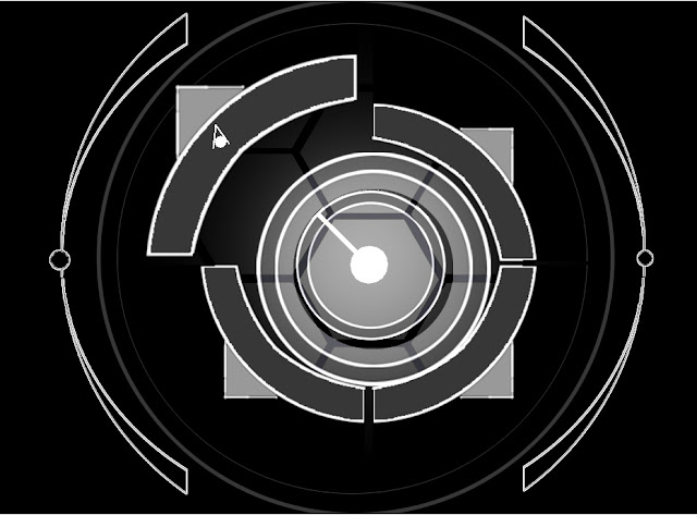
Interface
I've noticed a lot of user interfaces are trying to be very blue. It's a nice color and everything, but we've now entered a sort of homogeneous stage where every computer program, real or fictional, is layers with this weird-looking cyan overlay. It's supposed to symbolize relaxation and intelligence, but most are just using it because it looks cool. (Why DID the "Jurassic Park" icon turn blue last year?) This was basically an attempt to make something ergonomic and intuitive while avoiding that most bizarre of trends.
Rendered in Clickteam Fusion 2.


Comments
Post a Comment
Thank you very much for your thoughts! If you have questions, we will attempt to reach back to you within the next few days.